Artwork is one of the highest-impact, lowest-cost tools in a property stylist's kit. This guide covers six professional principles for selecting artwork that enhances buyer appeal, creates emotional connection, and helps properties stand out — without overwhelming the space or the budget.
Helping Your Clients Choose the Perfect Artwork: A Property Stylist's Guide
Artwork can transform a property from forgettable to extraordinary. It introduces colour, creates focal points, fills awkward wall spaces, and — when chosen well — triggers the emotional response that turns an inspection into an offer. As a property stylist, guiding clients through artwork selection is one of the most valuable services you can offer. Here's how to do it with confidence.
- SCALE IS EVERYTHING
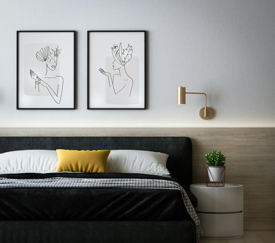
The single most common artwork mistake in property styling is going too small. A modest print on a large wall looks lost, uncertain, and amateurish. It signals to buyers — subconsciously — that the space hasn't been thought through. The rule: artwork should fill approximately two-thirds to three-quarters of the wall width above a piece of furniture. For large, open walls, consider a gallery arrangement of complementary pieces rather than one undersized print. When advising clients, always bring a tape measure. Measure the wall, measure the furniture, and give them specific dimensions to work with.
- STYLE FOR THE BUYER, NOT THE OWNER
This is the hardest conversation to have with clients — but it's essential. When styling for sale, artwork isn't personal expression. It's a tool for buyer connection. Pieces that work well across most Australian buyer demographics:
- Landscapes and nature scenes (particularly Australian landscapes)
- Abstract works in calming, neutral tones
- Local or regional scenes that create a sense of place
- Black and white photography
Pieces to avoid: overtly personal, political, or religious works; anything that might polarise or distract.
- SOURCE WIDELY — BUDGET ISN'T A BARRIER
The digital marketplace has transformed artwork sourcing for property stylists. Quality pieces at every price point are available through:
- Online galleries and print-on-demand services
- Local artists' websites and Instagram accounts
- Markets and pop-up art events
- Affordable framing services that elevate budget prints
Remind clients that a well-framed $80 print can look like a $500 piece. The frame matters as much as the artwork itself.
- CONSIDER MONOCHROME AS YOUR DEFAULT
When in doubt, black and white works. Monochrome artwork is the most versatile option in property styling — it complements virtually any colour palette, suits both contemporary and traditional spaces, and never clashes with existing furnishings. For properties where the décor palette is uncertain or mixed, monochrome is your safe, sophisticated default.
- USE CONTRAST INTENTIONALLY
Thoughtful contrast creates visual interest and helps properties stand out in buyers' memories. A contemporary abstract piece in a period home. A bold landscape in a minimalist apartment. These pairings create a "moment" that buyers remember. The key word is thoughtful — contrast for its own sake reads as confusion. The piece should feel like a deliberate, confident choice.
- THINK BEYOND CANVAS
"Artwork" is broader than most clients realise. Photography, textile pieces, sculptural wall objects, framed botanical prints, architectural drawings — all of these can serve as artistic focal points. Expanding the definition opens up more distinctive, affordable options that can perfectly suit a property's character.
FREQUENTLY ASKED QUESTIONS
What size artwork should I use for property styling?
As a general rule, artwork above furniture should span approximately two-thirds of the furniture's width. For large walls without furniture, go bigger than feels comfortable — undersized art is one of the most common property styling mistakes.
What type of artwork sells homes best in Australia?
Landscapes, abstract pieces in neutral tones, Australian nature scenes, and black and white photography tend to have the broadest buyer appeal across Australian markets. Avoid anything overtly personal, political, or religious.
Where can property stylists source affordable artwork in Australia?
Online print-on-demand services, local artists' social media, markets, and affordable framing services are all excellent sources. A well-framed budget print can look premium — the frame is often more important than the artwork itself.
Should artwork match the furniture in a styled property?
Not necessarily. Artwork should complement the overall palette and feel of the space, but intentional contrast — a bold piece in a neutral room, or a contemporary work in a traditional space — can create memorable visual interest that helps the property stand out.
READY TO START?
If you're ready to take the first step, the IIHS Property Styling Certification is the place to start.
It's Australia's first and oldest property styling training program — built by someone who has run a large staging business, trained over 750 graduates, and spent more than a decade in this industry.
You'll learn everything you need to work professionally as a property stylist — from staging theory and buyer psychology to running your own business — in a self-paced online format that fits around your life.
Explore the IIHS Property Styling Certification: https://style.naomifindlay.com/art-of-property-styling
Comments